
Email of the day on log scale versus arithmetic charts
This is a general comment about charts. I think all charts should be logarithmic, particularly when the range of prices is large. For example if a security moves from 100 to 300 in a straight line on a linear chart, the rate of change is actually decreasing. When a security's rate of change softens a logarithmic graph shows it more clearly, perhaps giving an earlier indication to watch more closely.

Thank you for this comment which is a subject that comes up at just about every venue for The Chart Seminar. There are good reasons for using both arithmetic and logarithmic charts but the primary difference in preference for many people is a question of leverage.
An unleveraged investor is looking for the largest percentage gain in their investments so a log scale chart will be useful because they will be sensitive to a loss of momentum or a declining rate of return. The drawback is that a log scale chart may exaggerate a loss of momentum which could simply be a medium-term consolidation. On the other hand log scale charts are undeniably superior when looking at really long-term price series where large moves have taken place
Leveraged traders on the other hand are really only focused on the number of points a price moves. The percentage change is less important so they strongly favour arithmetic charts.
The problem with only looking at one or the other is that as prices improve the data is compressed in a log scale chart because it is increasingly difficult for prices to double as they increase. As a result log scale charts do not accelerate to nearly the same extent as arithmetic charts so you lose the behavioural interpretation of the chart.
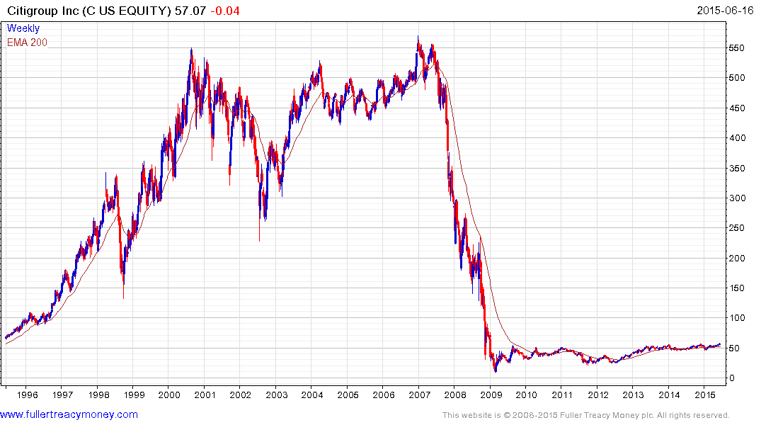
In base formations an arithmetic scale compresses the price action so that you don’t see the important activity going on in the congestion area with any clarity. A log scale chart gives us much more perspective. When a base is completed some percentage change investors conclude it has already gone too far because they are conditioned by the volatility of the range in terms of its percentage moves rather than appreciating that a range is an explosion waiting to happen.
Contrast the below arithmetic and log scale charts of Citigroup as an example.
.png)
The actions and motivations of investors are very important at major tops and bottoms so in addition to asking the filter question “Is there any evidence of type-1, 2 or 3 top or bottom development?” it is also useful to recognise that traders and investors have different motivations and different interpretations of exactly the same data. I fully believe it is useful to look at both while monitoring consistency characteristics.
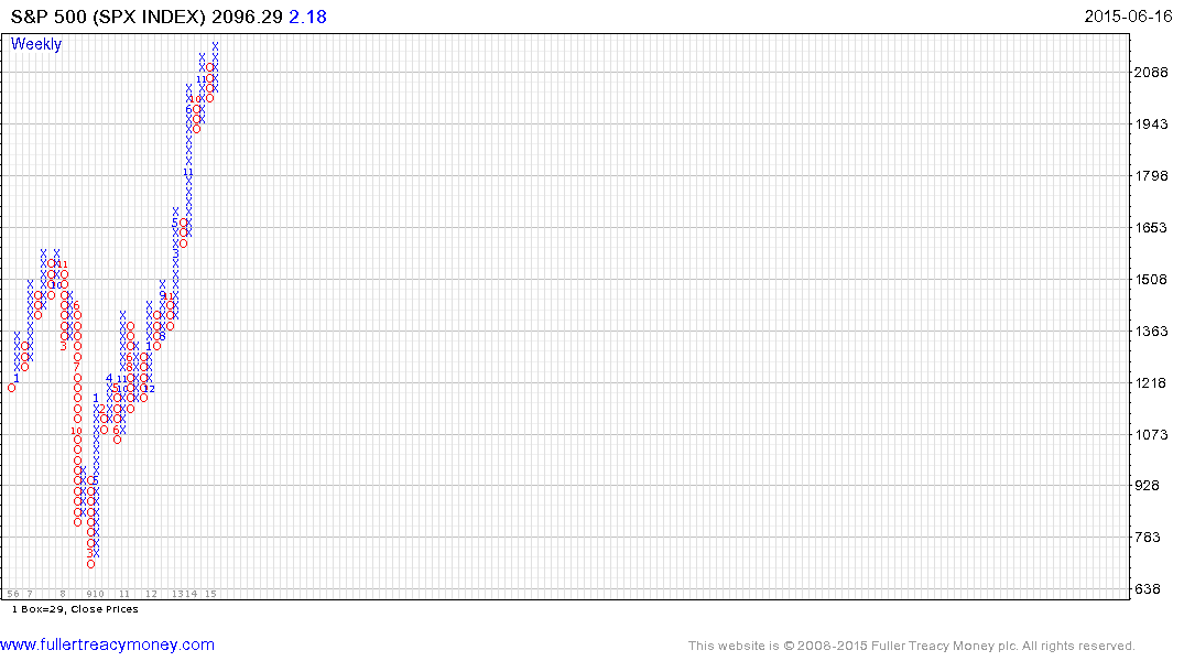
It is also worth pointing out that the S&P 500 hasn’t pulled back by more than four units of scale on this 1% point and figure chart since late 2011 and that a progression of higher reaction lows is evident since June 2010. When that is broken, it will represent a major inconsistency for the six-year uptrend.
Back to top