Email of the day - on the colour of candle charts:
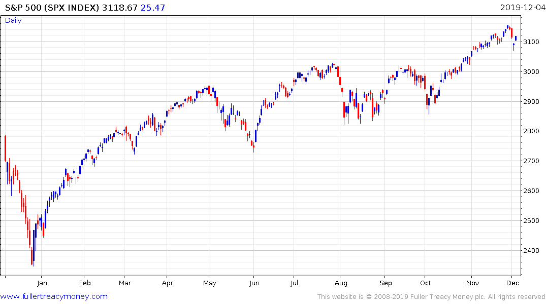
I hope all is well. I was wondering why if the S&P500 index fell the graphic is showing blue as per the attached screenshot? Could it be that it opened down but closed above that level and thus the chart records this as an up day? Thanks very much.

That you for this question which others may also have an interest in. Yes, that is exactly what happened. The S&P500 gapped lower off the open and improved modestly from that initial swoon.