
The Dow/Gold Ratio

The Dow/Gold Ratio is one of the most storied ratios in finance not least because it is made up of two of the instruments with the longest back histories. We can spend a great deal of time thinking and writing about secular bull and bear markets but the Dow/Gold ratio gives us evidence of how major bull markets transition into decade long periods of underperformance of stocks versus gold before transitioning again into decades long bull markets of relative outperformance by stocks.
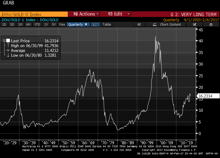
There are three major peaks and two confirmed major lows on the above chart.
Each of the three peaks is higher than the last with the 1965 peak 65% higher than the 1929 peak and the 1999 peak 50% higher than the 1965 peak. There is 36 years between the first two peaks and 34 years between the second and third peaks.
History doesn’t repeat itself but it often rhymes. Therefore if we take an average of 35 years and 58% then the near peak will occur in 2034 at 66.
Now let’s look at the declines. The decline between 1929 and 1933 occurred very swiftly because the price of gold was static due to the gold standard and stocks crashed. Subsequently stocks outperformed but only very modestly until about 1942 when a clear uptrend began to take shape. Therefore we could conclude it took 13 years between the 1929 peak and when stocks displayed a convincing pattern of outperformance.
It took 15 years for the ratio to move from the 1965 to the 1980 trough with the most aggressive portion of the decline occurring after Nixon quit the gold standard in 1971. .
The decline from the 1999 peak took 12 years.
The 1932 low was at 2.07, the 1980 low was at 1.32 and the 2011 low was a 6.72. There is nothing consistent about this pattern if we are to assume the 2011 low was the low of this cycle.
I would argue that since the decline was relatively similar in duration to previous periods of underperformance by stocks that the balance of probabilities rests with the argument that the 2011 low is long-term low for the ratio.
I suspect those most bullish about the gold will be looking at the reversal that took place in 1976 which saw the ratio go to a new all-time low in 1981. Either a cataclysmic stock market shock and/or phenomenal bull market in gold from today’s levels would be required to drive the ratio down to the
1 to 2 area from the 16 level where it stands today.
One important consideration is that it was a massive stock crash that resulted in the 1930s low because gold was fixed. A phenomenal bull in gold occurred when it was unfixed and that contributed to the next low in the early 1980s. The question now is whether it is possible for gold to get back to that low ratio of outperformance relative to stocks when it is freely traded? That’s not a question we will be able to answer conclusively until the next major peak is confirmed so we can only deal with the reality provided by the market which is that the 2011 lows is of at least medium-term significance.
Let’s look at the individual constituents of the ratio.
There is a major disparity between comparing the performance of a stock market index with a commodity. The members of an index change while gold is immutable. That generally means when broad stock market indices experience secular bear markets they tend to range which allows leadership to change and confidence to be rebuilt.
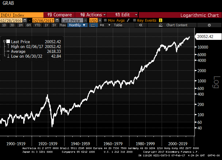
That’s exactly what we see in the Dow Jones Industrials Average. It experienced a lengthy range in the early 1900s, again in the 1930s, another lengthy range between 1965 and 1982 and another between 1999 and 2011. These ranges coincided with major advances in the gold price.
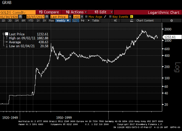
Gold is also capable of spending decades ranging in between these periods of extreme outperformance. This chart from 1900 gives us three examples of gold spending lengthy periods ranging. If history rhymes it could spend another lengthy period ranging between $1000 and $2000.
With gold prices today in the region of $1240 that leaves ample room for an additional rally towards the 2011 peak at some point.
Meanwhile the balance of probabilities rests with the Dow Jones Industrials Average outperforming for nearly another 20 years.
Here’s the fun part. Let’s make some guesses and since we are talking about 20 year timeframes these can only possibly be guesses.
From trough to peak the Dow Jones Industrials rallies by 6,96, 22.94 and 17.90 times during its major bull markets in the 20th century. The 2008 low was at 7062 so if it rallies by average 16 times over the course of the twenty years it will hit 112,992. At that point if the ratio is close to 66 then gold would be at $1712.
On the other hand if gold is closer to $1000 which I suspect is unlikely then we could expect the Dow Jones Industrials Average to peak close to 66,000. Charles Kadlec’s book Dow 100,000 published in 1999 represented the epitome of cheerleading considering how much the Index fell in the subsequent bear market. Nevertheless it is not only possible that level will be reached but likely if historical precedent follows through.
I know these sound like ridiculous numbers but consider this; the purchasing power of the Dollar has collapsed over the last century and there is no reason to believe the process is about to reverse. In fact if central bankers and governments get their way it will accelerate. After all there is a great deal of debt outstanding and inflation is the traditional solution to such problems.
Perhaps the greatest message of the Dow/Gold ratio is that both stocks and gold are effective hedges against inflation though seldom at the same time.
To demonstrate this is not purely a US phenomenon I created this chart of the FTSE All Share divided by gold redenominated to Pounds.
The FTSE All Share is the equity Index with the longest back history in the UK so we can create 46 years of back history for the ratio. We see two peaks, two major declines but this time the ratio tends to spend a lengthy period ranging following the declines before giving way to a new bull market.
Right now both the FTSE All Share and the Pound price of gold are both pretty steady but again the long-term outlook is for stocks to outperform considering gold has already had a major bull market in the last decade.
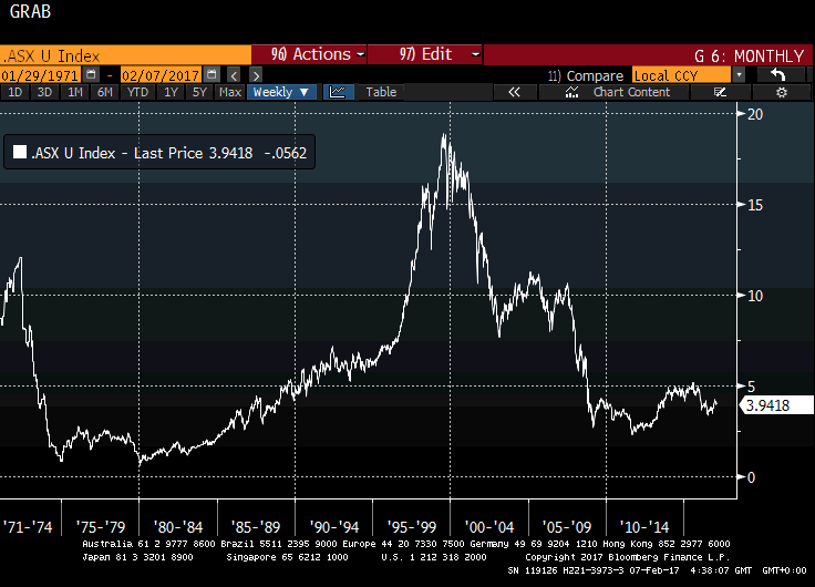
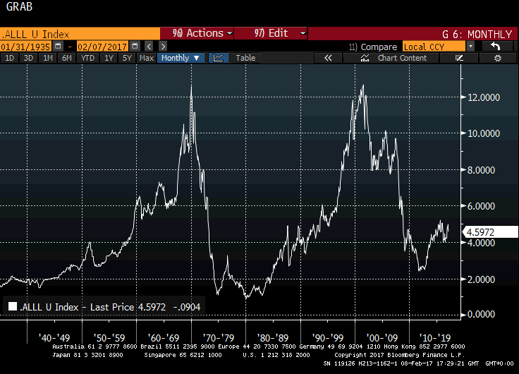
The Australian All Ordinaries index goes back to 1935 but the RBA only posts Australian Dollar cross rates from 1969. As a result I created two versions of the stock/gold ratio for Australia, one using the Australian Dollar price of gold, the other using the US Dollar price.
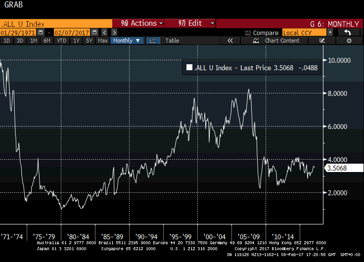
The Australian Dollar version hit an important peak in 2007 but that peak was substantially below the peak posted in early 1970s. That is probably a reflection of the relative decline of gold mining as a constituent of the Australian economy as well as the relative strength of the currency in the 2000s. The ratio is now ranging with a mild upward bias suggesting stocks are outperforming in a modest fashion.
The US Dollar version of the ratio offers examples of two almost identical periods of major outperformance relative to gold and two similarly sized declines with important lows in 1980 and 2011. Due to the fact that this chart is not currency normalised we can only draw conclusions from the perspective of foreign investors in Australia but there is a clear cyclicality for when it is best to own shares and when to own to gold.
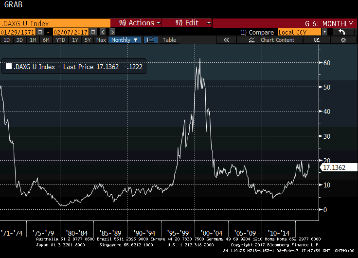
The German DAX Index goes back to the early 1950s but we only have history for the Deutsche Mark from the early 1970s. Nevertheless, the ratio bears a striking resemblance to the above charts. 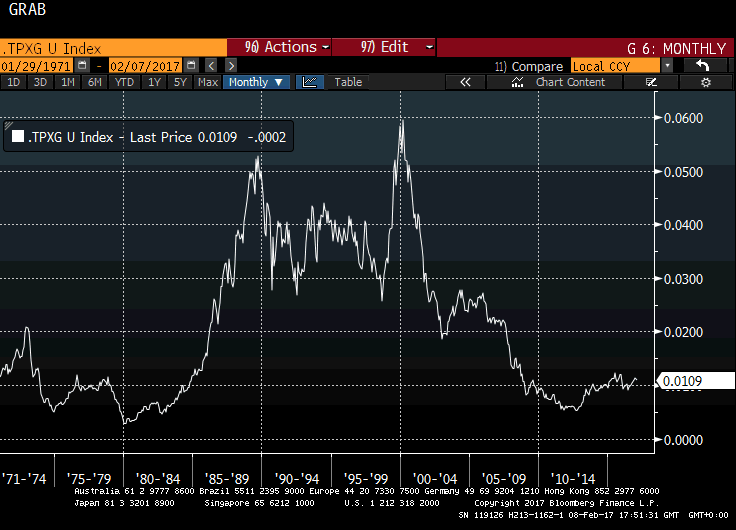
The Topix Index / Gold in Yen chart is the only major Index where there is a clearly different chart pattern and this might be explained by the timing of Japan’s bear market which coincided with a bear market in gold for much of the 1990s. Nevertheless it also hit an important low in 2011.
Short-term, there is scope for gold to outperform as it rallies from relatively depressed levels. However if we confine ourselves to talking about secular bull and bear markets the balance of probabilities rests with stocks outperforming over the next couple of decades.