
Email of the day on the influence of mega-caps on the performance of the S&P 500:
Given that (apparently) the FANGS account for about 50% of the total gains in the S&P500 over the last 2 years, it would be interesting to see what a chart of the S&P500 minus the FANGS would look like. Does such a chart exist?
My gut feel is that the chart would look more like the Dow Jones Industrial Index

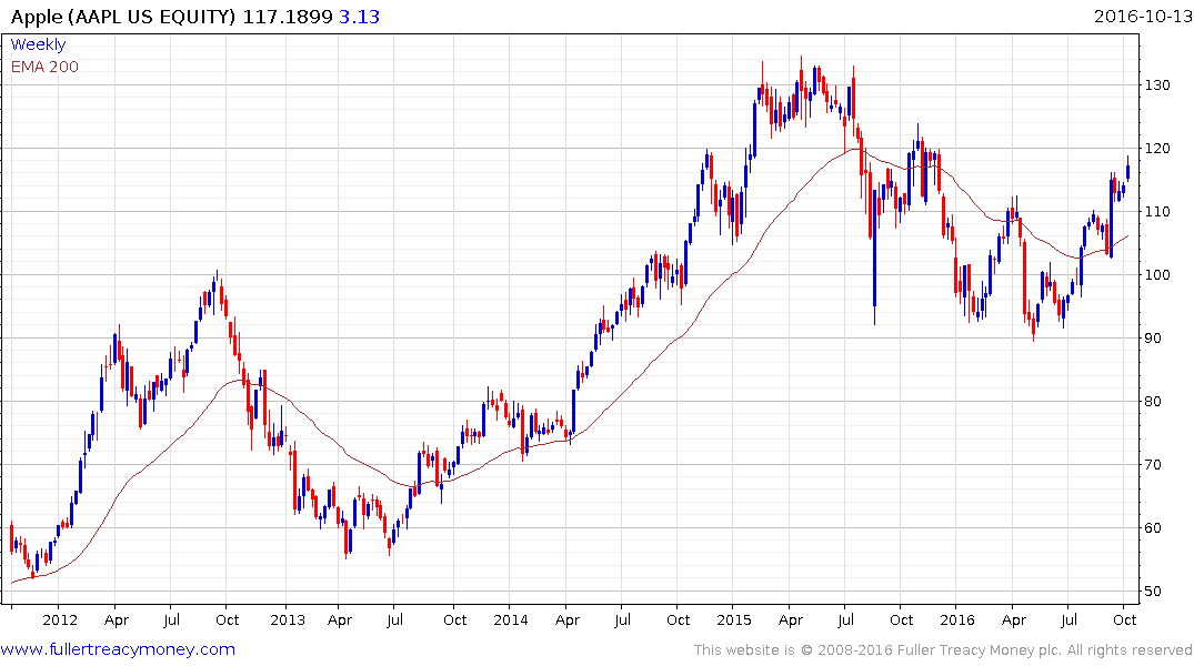
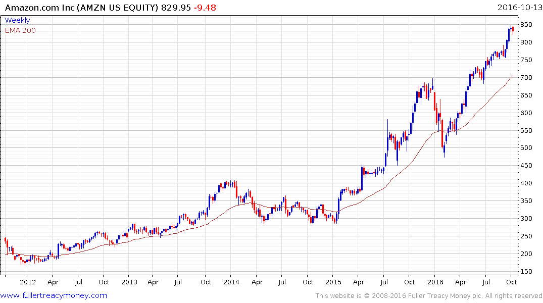
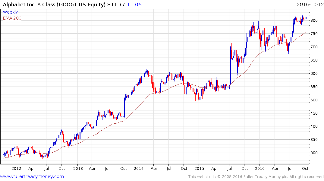
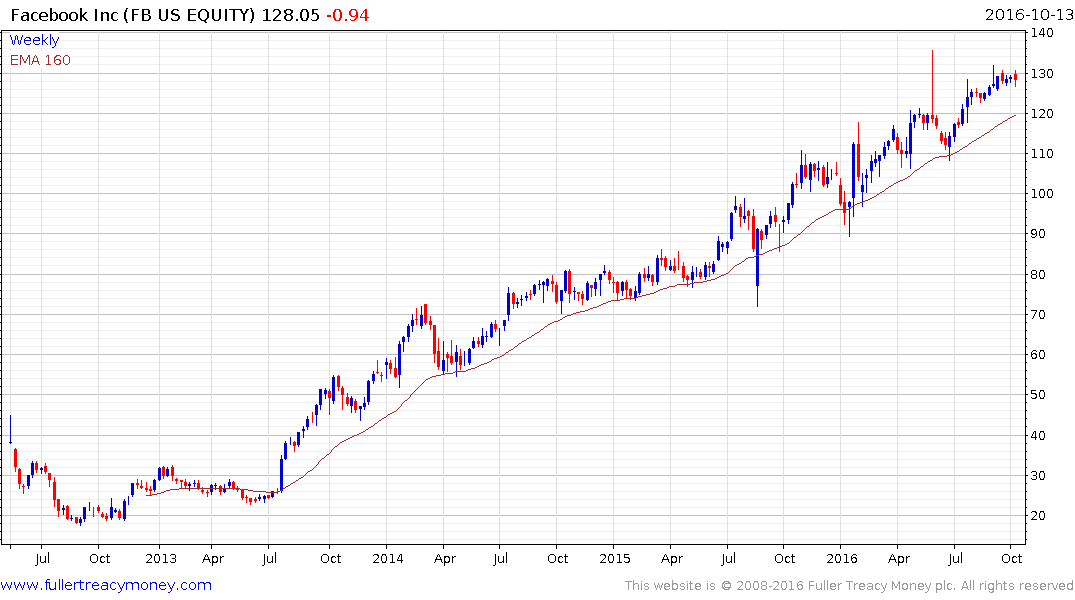
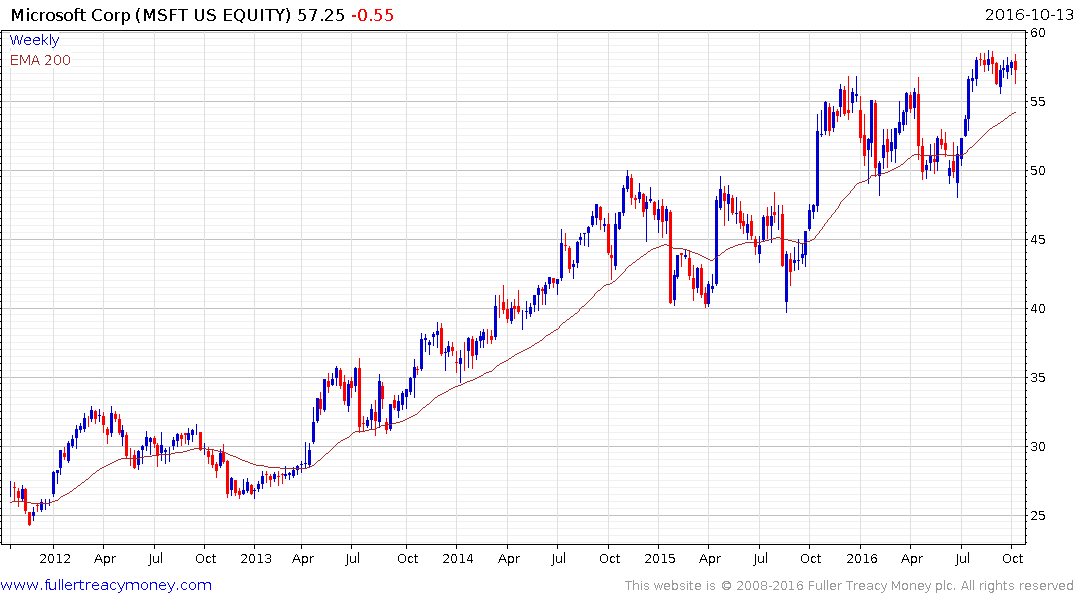
Thank you for raising this important question. I don’t have a chart that removes Apple, Alphabet, Microsoft, Amazon and Facebook from the performance of the overall index but I did create this spreadsheet ranking the constituents of the Index by market cap.
We can see from the table these five shares represent 12.05% of the index’s market cap. Exxon Mobil, Berkshire Hathaway, Johnson & Johnson, General Electric and JP Morgan add another 7.79%. That means 10 shares represent almost 20% of the index. The top 20 shares represent 30% and the 89 with a market cap of more than $100 billion represent 61.57%.
While the relative weightings of the Dow Jones Industrials and the S&P500 are different, they are both now testing the region of their respective 200-day MAs. If their breakouts are to hold they will need to find support soon.
A challenge is that shares like the top five are at risk of a reversionary pullback and that could weigh additionally on the performance of the Index.