Email of the day on long-term bond yield charts
“I attach a chart from the chart library - to draw your attention to a problem I have noticed today.
“Please observe that on the X-Axis, the distance between =1975 and 1985 is only about 20% of the distance between 1985 and 1995.
“My gut feeling is this is simply a matter of lack of density of data points ... but the result does not look good ...... and could be easily fixed in a number of ways.”

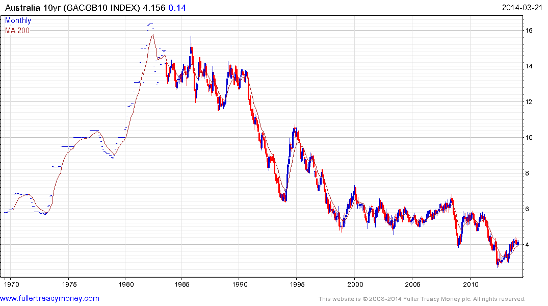
Thank you for sending through the chart and for raising a question which may be of interest to subscribers. The reason the scale is not displaying correctly is because daily data for Australian 10-year yields only became available in 1983. Since you are attempting to draw a daily chart over 40 years, the charting engine is attempting to fit the data into the timeframe you requested. If you move the period of the chart to monthly you will you will see that the scale is correct. However since we only have closing values on a monthly basis before 1983 we cannot draw candles. It is for this reason that we mostly display line charts for very long-term bond yield data.