
Email of the day (2)
"I am looking forward to your Chart Seminar next month.
"In the mean time I would be grateful if you could tell me where I can find a chart or charts which show the yield curve. The email of the day on the subject was very interesting and I would very much like to see for myself in the chart library. Is there any way in which you could provide links so that items mentioned in your daily review can be examined in graphic form."

Eoin Treacy's view Thank
you for this email which I'm sure will be of interest to other subscribers and
I am looking forward to meeting you at next month's Chart Seminar in London.
A yield
curve is a chart made up of the various different yields available across the
breadth of maturities for any sovereign. In the Chart Library, we use the spread
between the 10yr and the 2yr to illustrate the historic relationship between
these two points on the curve. Predefined charts for various 10yr-2yr spreads
can be found in the Spreads and Overlays section of the Chart Library. (Also
see Comment of the Day on March
4th for examples of all those currently available.) You can also create
comparative charts such as those in the examples immediately below using the
Charting Tool. Here are some instructions on how to do this.
Once
you have found the spread you are interested in, click on the Charting tab in
the charcoal bar above the chart. A popup window will appear. Click on the Analysis
dropdown menu and select Comparison. An additional dropdown menu will appear
where you can select the S&P500, which is the first item on the list. Next
hit the Apply button.
I have
copied some sections from yesterday's email below and inserted what I believe
are the relevant charts:
1)
1/1981-7/1982 with a fall of 27%
on the S&P500
2) 4/2000-10/2002 with a fall of
49%
3) 10/2007-4/2009 with a fall of
56%
And
1. Rising US
Treasury yields 10/1980-7/1982 together with rising interest rates and inverted
yield curve heralded a bear market from 1/1981-4/1982
2. Rising yields 7/1999-7/2000 in
parallel with rising interest rates and inverted yield curve 4/2000-10/2000)
and also a high oil price heralded the bear market 2000-2003
3. Rising yields 7/2006-10/2006 also
in parallel with these other indicators was again a warning of the bear market
that began 10/2007
"However, Treasury yields alone were not sufficient to signal a bear market
ahead:
4. Rising yields 7/1983-7/1984 and
also rising interest rates 4/1984-7/1984
occurred at same time as a market correction 1/1984-7/1984 but there was not
a bear market. The yield curve stayed above zero.
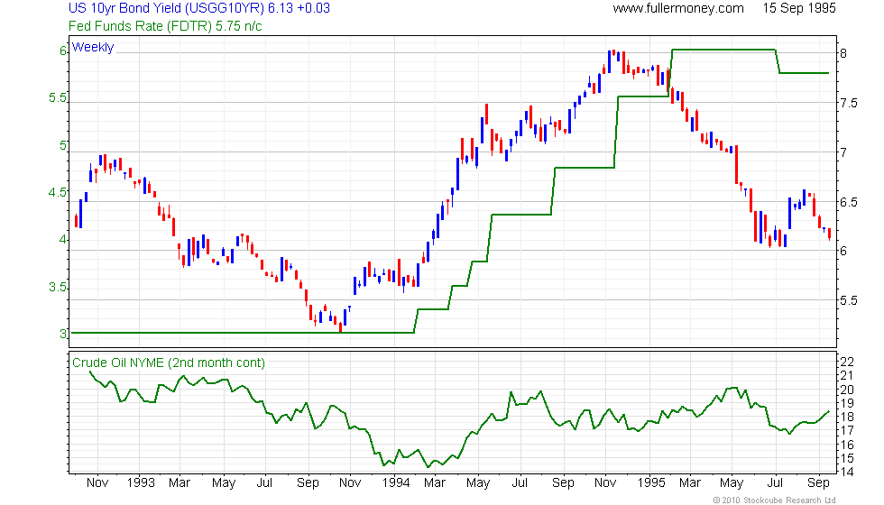
5. Rising yields 1/1994-1/1995 together
with rising oil price 7/1994-10/1994 and rising interest
rising rates 7/1994-10/1995 did not initiate a bear market. The yield curve
was positive.
To focus on the desired timeframes, I pulled up as much data as the Chart Library
has and then zoomed in to the parts I was interested in. To zoom, hold down
the left mouse button and drag the shaded area to the left or right, highlighting
the area you wish to enlarge. As soon as you release the mouse button, it will
zoom in.
An inverted
US yield curve is a useful lead indicator of recession but it is also worth
noting that it provides a relatively long lead, often in excess of a year. This
suggests that once the yield curve becomes inverted it is time to begin thinking
seriously about an exit strategy rather than selling everything at once.